
Power BI Consulting Services
Recently, there has been wildfire adoption of Power BI to create and share data visualizations. It’s pretty easy to pick up and use, and the price is cheap, free, even for some use. Power BI is part of the larger trend known as Self-Service B.I.
Self Service BI, a Growing Trend
The self service aspect of it, however, does not mean fewer opportunities for me, though. Instead, the growth of B.I. has exploded, and while my potential clients are able to get started on their own, they sometimes reach a point where they need help from an expert. Here are a few typical ways that a Power BI user might work with me:
- making visuals work together as part of a whole solution
- creating a data model that delivers valid, predictable results
- defining measures using DAX
- getting data into SSAS Tabular for greater scale and performance
Simple Can Become Difficult in Power BI
Here is an easy-to-understand Power BI example. It uses data from the COVID Tracking Project.
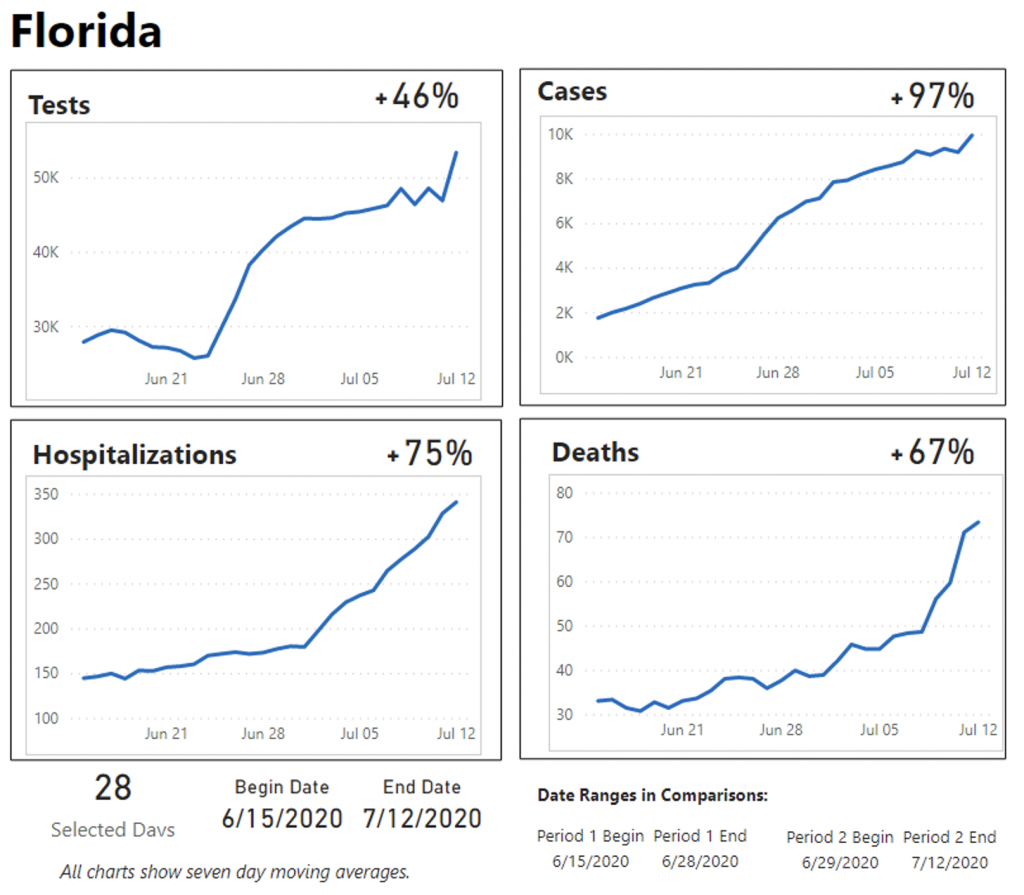
Each of the four charts show COVID data for Florida, plotting the graphs for each was achieved by creating a seven day moving average (SMA) for each of the four measures: Tests, Cases, Hospitalizations, and Deaths.
Here is the DAX I used to compute the SMA:
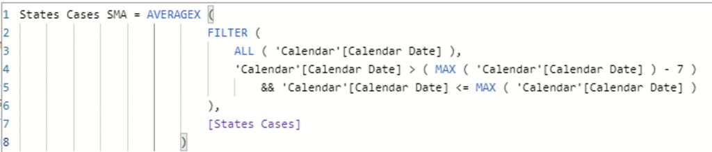
The creation of such a DAX measure is sometimes the point at which a self-service Power BI user might reach out for help from a BI developer. This example, though, is not terribly tricky, and some DAX examples like this can make use of existing design patterns that can be found on the internet.
The difficult part of this example was the computing of the percentage of change for the selected period. In this example, the user can select any date range, and a comparison will be made between the first half of the date range to the second half of the date range. If the user requests a range of dates that is an odd number, then the last date of the first period is repeated as the first date in the second period.
The problem of an odd number of dates could be done differently, but this is the method I chose. I wanted to have an equal number of days in each period. To achieve this, I created several measures:
- Number of Selected Days
- Selected Date Begin
- Selected Date End
- Selected Date P1 End (end of period one)
- Selected Date P2 Begin
- Deaths Second Half Selected
- Deaths First Half Selected
Those measures work like building blocks that can be used when defining the measure that calculates the percentage change. By creating those intermediary measures, the final measure was easy:

Measures and Variables
The example above could have been achieved with the use of variables instead of measures for the date selections. Initially, I made it like that, with variables in the DAX for the final measure that computed percentage change. However, I ended up needing to make the measures after all because I wanted to put the period begin and end dates on the report (see in the image above, begin and end dates are in the footer).
The use of variables inside of DAX is sometimes a “jumping off point” for Power BI users to consult with a developer. Power BI makes it easy to produce visuals very quickly, but that’s only if you have all the measures that you need (or you can make your measures without much code).
I am Your Resource for Power BI
Don’t be discouraged by the challenging aspects of Power BI. Keep your projects moving along by working with me as a resource. I am happy to collaborate with you and/or your existing team to help you achieve your goals. It doesn’t cost anything to call me and find out if it’s a good fit for us both.
Email: chris@majorleaguereports.com
Phone: 407-865-4940
Zoom: meeting ID upon request