Infected by COVID Data
In March 2020, when the USA shut down to combat the Corona Virus, my workload dried up (like it did for many people). I used some of my newfound extra time to work with the publicly available COVID data. Here is how that unfolded.
Part 1. Getting Started Was Easy
Thanks to all the people behind the COVID Tracking Project, it was easy for me to get started. I clicked a few pages on the CTP site, and I noticed they had an API that returned JSON data, and I knocked out a quick SSIS package to import USA COVID data into SQL.
I used a third-party SSIS component from ZappySys, their JSON Parser Transform object. With that, pulling this data into SQL was pretty easy.
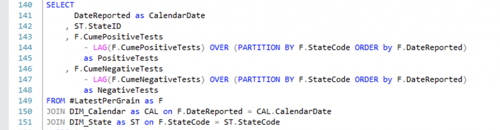
The only “snag” was due to the way they recorded the values each day — as cumulative totals per state. That makes some graphing easier for some people, but it’s not really the way I want to store data in a DW, so I used a SQL windowing function to get the daily totals and I made fact tables that included daily counts instead of cumulative to date. (Line 144, below)
Part 2. Keeping Up With the Joneses
After I pulled in the CTP data, I ran some quick reports in Excel just to satisfy my curiosity. At this point in the United States, the reported data was really limited to the overall cases and deaths in the USA and in New York. I got to thinking I could build something quickly in Power BI and share it. So I looked at the Power BI Community pages.
When I perused the gallery I made a few conclusions:
- There weren’t many dashboards (27 total).
- They didn’t have useful measures, just totals.
- I needed world-wide data.
- I also needed county-level granularity (for the USA).
So instead of creating visualizations with the CTP data, I decided to use another dataset, the Johns Hopkins data which has US counties and also world-wide data.
Part 3. Keeping Up With Johns Hopkins
Dear John,
Thank you for all your hard work, but…
Yes, it is borderline ungrateful to joke about writing a “Dear John” letter to “break up” with Johns Hopkins. After all, they’ve performed a valuable public service. However, the data they provide has had some quality issues.
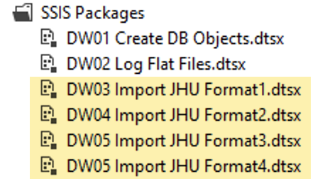
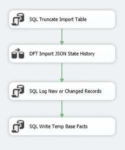
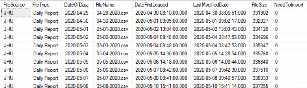
This image of SSIS packages shows that I wrote four different packages to import JHU data because they made several changes to the file format, and when they made a change, they did not re-export all the old data in the new format. For maximum flexibility, my solution can re-load all of the data from scratch into a blank database. The only way to achieve that is to maintain a package dedicated to handle each format (as I did).
Perhaps that wasn’t a huge inconvenience, except that I wrote a package to log the flat files as they were made available, and my logging package would need to hand off to the correct import component.
Visual Studio includes a File System task, but I opted to use (again) a component from ZappySys, their Advanced File System Task which is much richer than the standard one in Visual Studio.
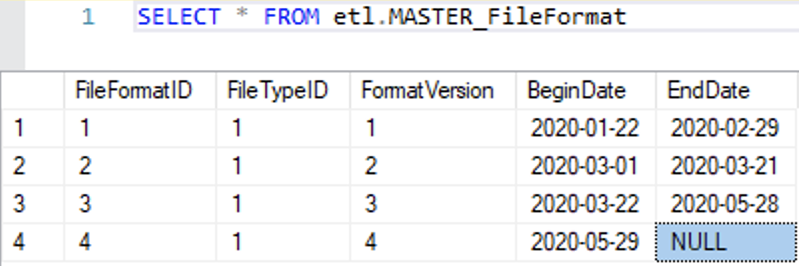
Logging the flat files is really overkill in a project like this, but it gives me a chance to show an example of how to do this sort of thing. I went down this road before I discovered that JHU was changing their file format over time, and now I needed another table that would determine what format each file was based on. Here is what that looks like:
Those minor gripes about file formats were only foreshadowing to the real problems in the data. JHU was continually changing the names of the locations. Usually each change was in the direction of improvement, but when they changed the data, the previously provided data was not updated (despite the data being published in a Git repository, which can handle versioning). Therefore, I had to create a crosswalk to master the data. Here is a portion of the crosswalk.
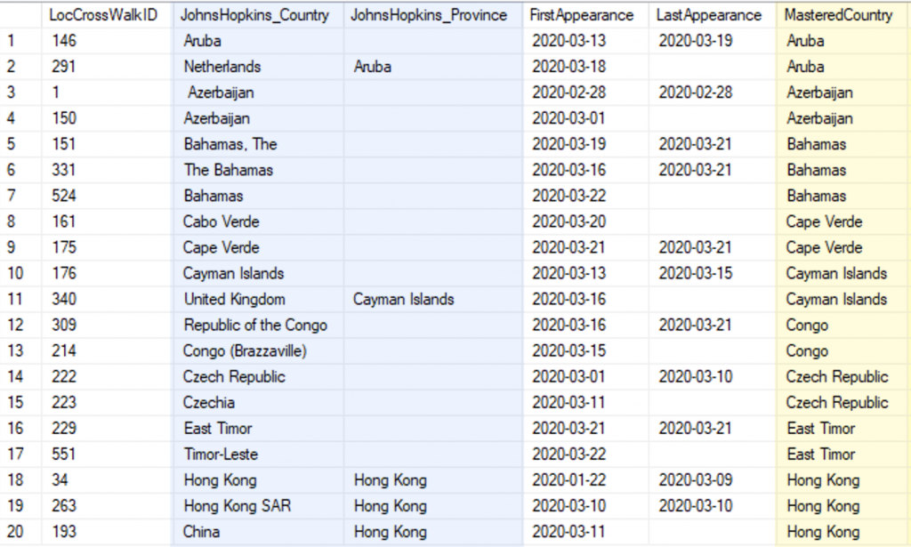
The columns in blue, on the left, are the raw values in the JHU data. The column in yellow, to the right, is the mastered value that would be stored in the data warehouse. Keep in mind, without such a process, all of the records for Bahamas (for example) would not fall in the same bucket.
I did more than just correct the inconsistencies. I also split outlying territories into countries. It was my thought that in the context of pandemic data, you don’t want the UK data to contain Cayman Islands. The same goes for Netherlands and Aruba. For what its worth, I did also provide a mechanism to re-join territories to their colonial parent.
Part 4. Enriching The Data
Because I intended to bring all of this into a useful dashboard, I gathered a fair amount of related data.
- Population — necessary for per capita measures
- Latitude and Longitude — often included, but sometimes incorrect
- Continent and Region
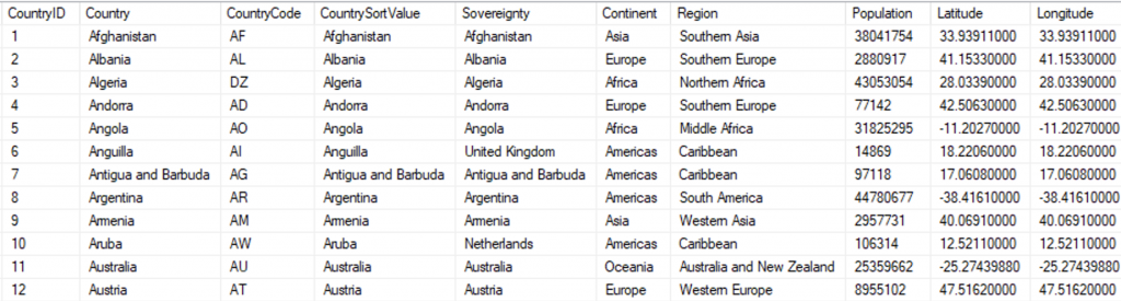
When complete, those became attributes in the Country dimension table. It looks like this:
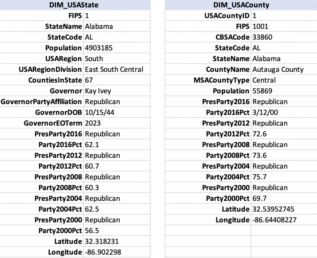
I constructed the same for USA States and USA Counties. Those dimension tables are wider than the country table, so I am showing just the first record from each, listing the columns vertically:
So far I’ve covered countries, states, and counties. Another useful dimension is the “metropolitan area,” often called an MSA, and more accurately labeled as CBSA (core based statistical area). Metropolitan areas are often how we think of our cities in the USA. I could relate the county data to CBSA data, so I built a dimension for USA Metro Areas, too. Here it is:
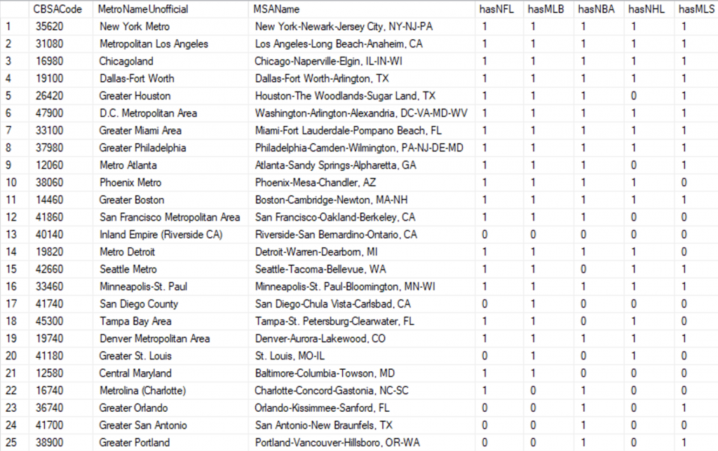
Notice how the MSA Names are really long? That is all I could get for names in the official data, but for reporting I really wanted short names so I had to look those up online. I felt it was important to know that Seattle is referred to as “Seattle Metro” while Detroit goes by “Metro Detroit.” There were a few that didn’t have a clear standard name, so I picked the best name by sampling various sources online.
Part 5. Completing the SQL DW
After adding a dimension for USA Metro Areas I had a fairly complete set of data that I could design proper measures for. I haven’t really covered this, but I designed it for a daily refresh:
- Git desktop client would pull refreshed JHU data
- SSIS logged every new or changed file
- SSIS imported new files from JHU
- SSIS pulled new data from CTP
- A stored procedure staged data and built fact records.
The solution, thus far, was a fairly proper data warehouse based on the dimensional model (Kimball), and I could, then, take it into SSAS Tabular where I could define measures that can be used in reports and dashboards. That’s exactly what I did. In Visual Studio, the Tabular model looks like this:
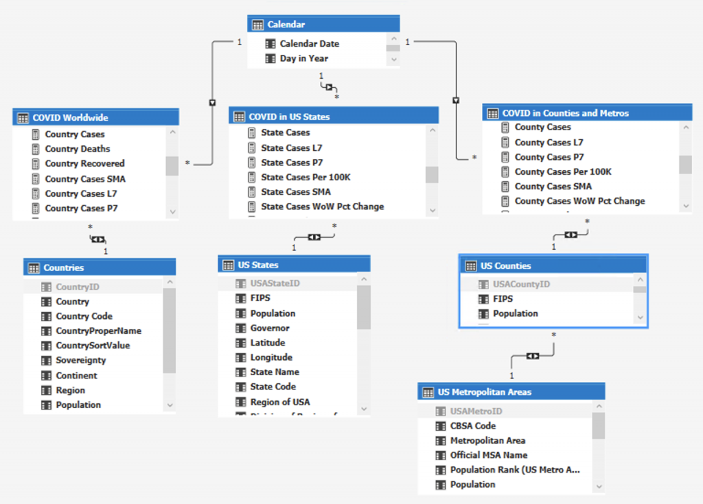
Quick Rundown: The top table is my calendar table, sometimes it’s called DIM_Date or DIM_Time in a SQL data warehouse. The calendar is a dimension, of course; as are the bottom four tables, all dimensions: Countries, US States, US Counties, and US Metropolitan Areas.
Across the middle, there are three fact tables: COVID Worldwide, COVID in US States, and COVID in Counties and Metros. I should say that in SSAS Tabular, it’s technically improper to continue using the terms “fact” and “dimension.” We don’t need them any more.
Part 6. Remodeling Before It’s Complete
My re-telling of this is a little bit out of synch with the actual re-modeling of data. Truth be told, I skipped the part where I originally built a single, fact table having multiple grains. Each record of COVID data could be a country, state or province, or a US county. I made it work, but then when I started writing measures to calculate per capita data, the coding was unnecessarily complex. The advantage of having a single table was that I could easily compare a county or a state with a country. I also liked the challenge of doing something difficult.
I decided, wisely, to drop it and write separate facts for each level of granularity: county, state, and country. The thing that really stinks about this is that when creating reports, you have to choose among different measures for the same thing, Country Cases for a country and State Cases for a US state. That might not sound like a big deal, but if you create a country visualization and want to copy/paste it for the basis of a state visualization, after pasting, you need to delete the measure and replace it.
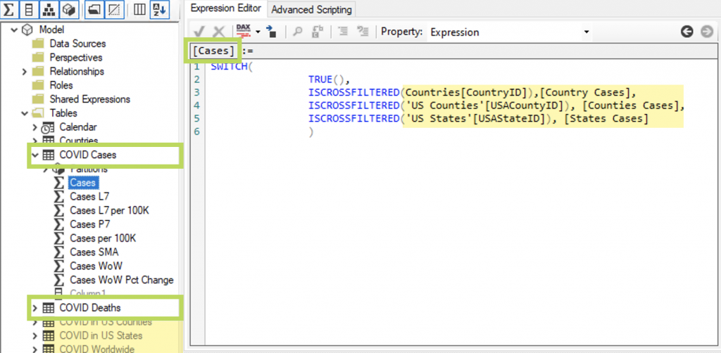
There is a really good solution for this, though. You can create a single measure for use that will call the correct measure that is needed. I did that, and I added empty tables to hold the new measures, now grouping them by what they are (cases or deaths) instead of what they belong to (countries or states).
Visual Studio is not always the best tool for these kinds of edits to SSAS Tabular projects, but the application, Tabular Editor works nicely. Here are the changes I just described, shown in Tabular Editor:
Part 7. Darkness at the End of the Tunnel
When I had the first inclination to work on the COVID data I went from idea to visualization in about an hour. After that first Excel chart, completed on April 21, 2020, I dedicated myself to build a proper data warehouse and created no visualizations until I was done with it two weeks later.
I got started on a worldwide dashboard first. Instead of just giving case counts and deaths by country, I decided to create new measures such as Count of Countries with Cases Rising (week over week), and Count of Countries with Cases Falling. Being immersed in this data caused a real malaise.
It’s hard to communicate what it was like except to point out that I was using all the same tools, and practicing the same methodology that I’ve used for my client work of more than ten years. Day in and day out I worked on the COVID data like it was my job. From every angle this project was just like any other, except for some glaring details:
- First and foremost, I see clearly in the data that the USA has done poorly, and my home state is among the worst in the country.
- The available data is full of undercounts at every level due to for various reasons — some innocent, some malevolent, some just due to lag.
- A significant portion of the population believe the opposite is true — that the numbers are over counted, and the pandemic is a hoax.
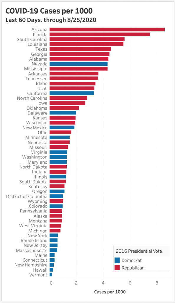
I’m not one of those people. I lost a family member to COVID, and I am concerned for the future, not just for our health, but our economic well being, too. Below is a chart I made with Tableau, ranking the states by cases per capita over the last sixty days, June 27 through August 25, 2020.
Thank you for your attention. If you are so inclined, I would be more than happy to hear from you.